Throughout Evergreen tables, also called grids, are used to display information. All grids can be navigated and modified using the same buttons, even if the available buttons or options might change between grids. Some grids allow you to perform actions on items selected in the grid.
The function bar can be found throughout Evergreen and enables you to work with the grids to page through pages, adjust the number of rows displaying, access the Actions menu, and manage your columns and Actions menus.
The function bar currently comes in two styles with similar functionality. Eventually all interfaces in the staff client will use the second function bar pictured below.


- Page through pages
- Actions Menu
- Adjust number of rows
- Jump to page
- Show Grid Options menu
- Text wrap
To perform actions, you must first select items in the grid. Select items by checking the checkbox on the left side of the item’s row. You may select all items on the current page of a grid by checking the checkbox at the top of the grid.
Then select the Actions button and choose an action. The available actions will depend on which interface you are currently using.
Caution
Selecting the checkbox at the top of the grid will only select items on the current page. To select more items, you may navigate to other pages and make additional selections, or change the number of rows that appear on each page.
The Grid Options menu can be accessed from the Function Bar by clicking on the gear symbol.
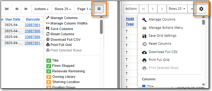
Some options in the menu and the resulting screens will differ depending on the version of the function bar.
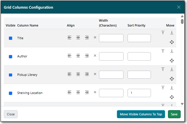
Library staff can customize what columns display, and how they display, in the grid for interfaces in the staff client using the Manage Columns option in the Grid Options.
Available configuration options are:
- Visible: Whether a column is visible or hidden.
- Align: Whether the contents of the column aligns left, centre, or right. By default, text aligns left and numbers align right.
- Width (Characters): What the width of a column is.
- Sort Priority: What order the data is sorted by default when displayed in the grid.
- Move: What order the columns display in. Columns can also be manually dragged and dropped when viewing the grid.
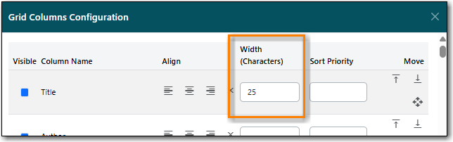
The width of columns can be adjusted for the grids. The method to do so depends on the version of the function bar.
In newer interfaces, you can use your cursor to drag the edges of the columns to expand or shrink them. You can also set a width, measured in characters, by selecting Manage Columns from the Grid Options menu. You can then enter a value in the Width (Characters) field for the applicable column.
In older interfaces, you can select Manage Column Widths from the Grid Options menu and then click Expand or Shrink to adjust the column sizes.
The column display can be reset to its defaults using the Reset Columns option in the Grid Options. This does not affect your saved settings.
All available columns for the interface are listed at the bottom of the Grid Options menu.
In newer interfaces, visible columns have a blue box next to them. Hidden columns have a white box next to them. To toggle the visibility of a column, select the column name in the menu. The change is applied to the grid and the menu remains open.
In older interfaces, visible columns have a green check next to them. Hidden columns have a yellow x next to them. To toggle the visibility of a column, select the column name in the menu. The menu closes and the change is applied.
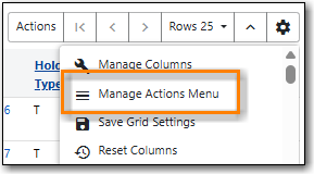
The newer function bar includes the Manage Actions Menu option.
- Click on the Show Grid Options (gear icon) menu.
Select Manage Actions Menu.
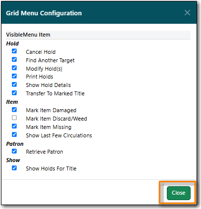
Make required changes and click Close.
- Click on the Show Grid Options (gear icon) menu again.
Select Save Grid Settings.
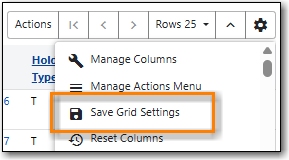
Changes made to a grid through the grid options are temporary and the display of the grid will revert to its previous settings the next time it’s viewed unless the grid settings are saved.
- Click on the Show Grid Options (gear icon) menu.
Click Save Grid Settings.
Tip
When saved, grid options are saved for the particular workstation. If you need to re-register your workstation you should use the original workstation’s name or you will need to re-set all your grid settings across the staff client.
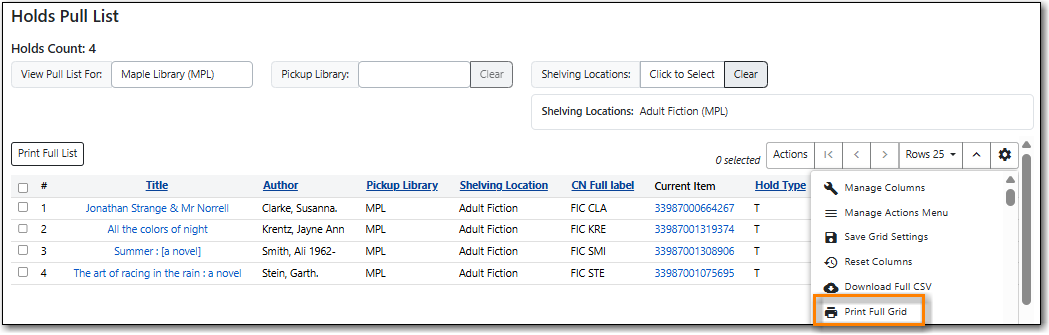
The Print Full Grid option available on the Grid Options menu (Gear Icon) will open a print dialogue and allow you to print the list which will include all the columns currently visible on the screen.
Note
The printed list will only include the items currently displaying on the screen.
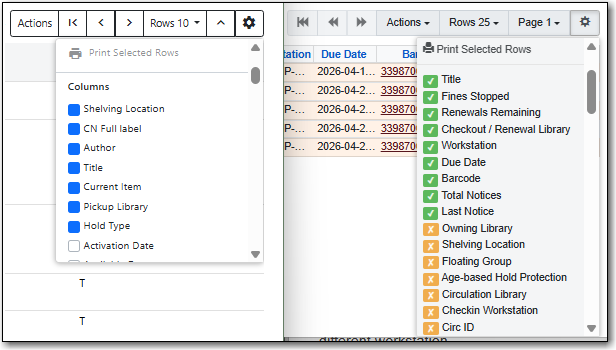
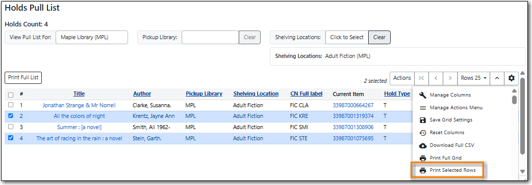
The Print Selected Rows option available on the Grid Options menu (Gear Icon) will open a print dialogue and allow you to print the selected rows as a list which will include all the columns currently visible on the screen.
Note
The printed list will only include the items currently displaying on the screen.
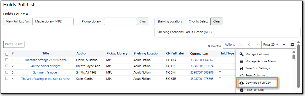
The Download Full CSV option available on the Grid Options menu (Gear Icon) will download a CSV file which will include all the columns currently visible on the screen.
Note
The downloaded list will only include the items currently displaying on the screen.
Some grids allow you to sort the grid by column. If this is possible, the column headings will be blue and underlined.
To sort the grid by a given column in ascending order (0-9, a-z), select the column heading. An up arrow will appear in the selected column heading. The grid will be sorted automatically.
To sort the grid by a given column in descending order (z-a, 0-9), select the same column heading twice. A down arrow will appear in the selected column heading. The grid will be sorted automatically.
To remove your sorting selections, refresh the page. This may erase your other grid selections.
Some interfaces include filters in the grid that enable staff to filter the available rows in the grid.

Depending on the data in the field the filters will either allow you to filter on Any/Yes/No or the text values.


When a column is filtered, it will display with a pencil icon. Clicking on that icon enables you to change the value of the filter. Filters can be removed individually per column by clearing the filter, or, all filters can be removed at once using the Remove Filters button.

Note
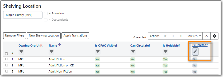
Some interfaces, such as the Shelving Location Editor, have default filters applied. The Shelving Location Editor has the filter for Is Deleted set to No so that deleted shelving locations do not display by default.
